Hybrid or 100% Renewables: Is there space for nuclear power in the fight against climate change?
Aim
Climate change is one of the most pressing challenges facing our world today. Getting the world to carbon net zero can be accomplished through two routes: 100% renewables or a hybrid route (which includes options like nuclear).
Google Colab Google ColabBackground
We can see from our pie chart just how dependent we are on coal for electricity production on a global scale. We can also see just how much of the world produces more than 20 tonnes of emissions per capita. We can not continue with the status quo.
Safety
Nuclear power is often considered unsafe due to largely well known disasters such as Fukushima or Chernobyl. This fear is unwarranted, and we can see this by looking at the rates of death associated with each source of energy. Both nuclear and renewables are much safer alternatives than the status quo. Safety is not a concern when comparing either pathway.
Carbon Emissions
Both options are low in carbon emissions, with wind just overtaking nuclear. It is important to note that we looked over these emissions in the long run using lifecycle emissions. Over time the emissions from construction are made up for due to the ultra low carbon emissions post commission and economies of scale. Looking at our graph, we can see that all the sources we are considering are remarkably better than coal.
Nuclear reactors cost billions and this price is only going up. On the other hand, renewables, solar in particular , are decreasing in price rapidly providing a compelling case for renewables. However, research by the IPCC suggests that overall all the cheapest and most effective solutions do include nuclear.
The only countries that have reached the threshold of decarbonisation are Norway, Sweden and France. Sweden and France with a nuclear/hydro/wind/solar/biomass mix with the first two being the majority. Even Germany, who is championing renewables, does not match this. We can see this information visually and can infer that nuclear power is a useful tool in decarbonising.
Capacity and Stability
Stability is an issue. Renewables in a microgrid are incredibly flexible and have low inertia. However, in order to have a safe and stable energy grid, we need some of the sources to have high inertia. We are currently largely supplementing this need with coal, which is destroying our planet. Nuclear is a good alternative and still gives us the stability renewables lack.
Conclusion

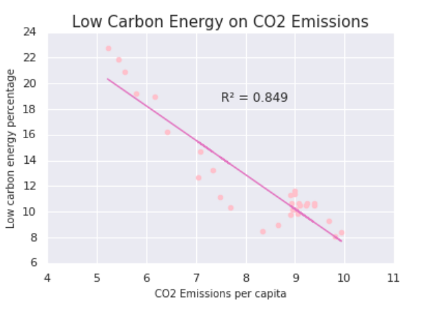
Our regression shows that everything improves if we reduce the carbon intensity of electricity, and it is clear through our graphs and analysis that both nuclear power and renewables will aid in this result.
Renewables are cheap to build, quick to build and allow for rural electrification, however they need a lot of space and infrastructure that currently doesn’t exist and lack stability (due to inherent variability). Nuclear on the other hand allows for great stability, but it is excessively expensive and slow to build; with the average reactor taking 108 months to build (time we do not have).
A 100% renewable economy right now would be unnecessarily complex and rely on research that is not yet fleshed out. Going for a pragmatic hybrid grid allows each source to balance the shortcomings of the other and allow us to deal with the climate crisis quickly and effectively.
Google ColabData
For all the data included, I either downloaded an excel or accessed data via an API. I then transformed it into a csv file, cleaned it in Python and put it into long form (TIDY). I then linked this data in various vega-lite data visualisations. There were some complications with adding interactivity, or certain characteristics to the bones of the vega-lite visualisations but work in tutorials and codecamp, as well as vega’s own troubleshooting meant all my data visualisations came out the way I wanted them to.
To access information from the EIA, I signed up for free API access. I had significant issues trying to develop a choropleth using this information. This was mostly because of ISO matching problems, and differences in country names. This would result in gaps in my map. I had to redo the code several times before my choropleth map was complete, with no gaps and interactivity.
I used a variety of data ranging from ourworldindata.org, the ONS, the EIA, and various statistical reviews. Our World in Data only offered data through excel direct downloads which means my data doesn’t update. Since most of the information was published annually, this wasn’t really a problem. I struggled to find much environmental data that had regular updates, suggesting that governments and institutions should consider monitoring and releasing climate data more regularly.