Week 1 :Embedding
Week One saw us setting up our websites and embedding two charts from the rapid charts repository. One is a line graph of UK Labour productivity between 1971 and 2021. The second one shows the greenhouse gas emissions of a variety of food in a stacked bar chart form.
Week 2: IMF Data
Credit Outstanding to all members, 1984-2022 - uncorrected chart
Credit Outstanding to all members, 1984-2021 - corrected chart
Our first chart is a recreation from the Financial Times. The second chart is "fixed" as it more effectively tells us the story about how much of this lending makes up global GDP; framing the data in a more understandable way. Our old chart suggests that 2022 is the riskiest year. Our adapted chart reveals it is 1984 as this was when credit outstanding represented the highest proportion of global GDP during our period.
Week 3: Inline Data Graphs
The growth rate of the big 4 countries (% annual)
Using inline data (organised and created in python) I created two charts both representing the sources that contribute to Global electricity production. Although it is clear in the first chart that the coal bar is much higher, the pie chart visual encoding makes the difference in proportions more visually clear, telling the story of how much we rely on fossil fuels clearer and more visually compelling.
Here is the link to the Google colab python notebook where I conducted the data analysis.
Google Colab Google Colab Google ColabWeek 4
Using a Google Colab python notebook, I scraped a website using pandas and then cleaned and normalised the data and exported into TIDY (long form) format. I then exported this into a bar chart that shows the sources of electricity in France. I chose this website because it was easy to scrape from, the table didn't have too many complex widgets. The data also corresponded with my research on nuclear power for my project, and was the best tabular source for the information I needed.
Here is the link to the Google colab python notebook where I conducted the data analysis.
Google ColabWeek 5: ONS Tax Dashboard
I used the ONS's API to create a loop and generate 9 charts diving into the different revenues of tax the HMRC collected. Here is the link to the Google colab python notebook where the data analysis was conducted.
Google ColabWeek 7 : Two maps: a base map and a choropleth
I focussed on Africa and electricity access for my base map and choropleth as it corresponded with my project, and my research into how necessary renewables on a micro-grid were for rural areas with lower access to electricity. My maps reveal that for our data, West Africa has incredibly low rates of universal electricity access, but that around 75% of Africa does in fact have almost universal access. We can infer this is likely a poverty problem that impacts rural areas the most.
Here is the link to the Google colab python notebook where I conducted the data analysis.
Google ColabWeek 8: Festival of Economics
In the 'Big Data' talk, Arthur Turrell said that recently the inflation of prices are hitting low cost goods more than general goods. I found this really interesting as the implications would be that the poorest would be the most hit by the cost of living crisis. I found a very helpful experimental review by the Office of National Statistics (Turrell's workplace). My first graph reveals that there is little differentiation between CPIH and lower cost goods over the period. Although there is notable increase in the lowest cost goods, when paired with information from our other graph, we can infer that these price increases are probably following a similar trend to all food and drinks, even those that aren't low cost.
Here is the link to the Google colab python notebook where I conducted the data analysis.
Google Colab Google Colab Google ColabWeek 9: Advanced Charts
Week 9 and 10 had us creating more advanced charts. The first advanced chart I made was a four graph trellis showing how different sections globally (high income countries for example) emit carbon emissions over time. The trellis helped to organize data into multiple dimensions and allow us to compare them visually in the same graphic.

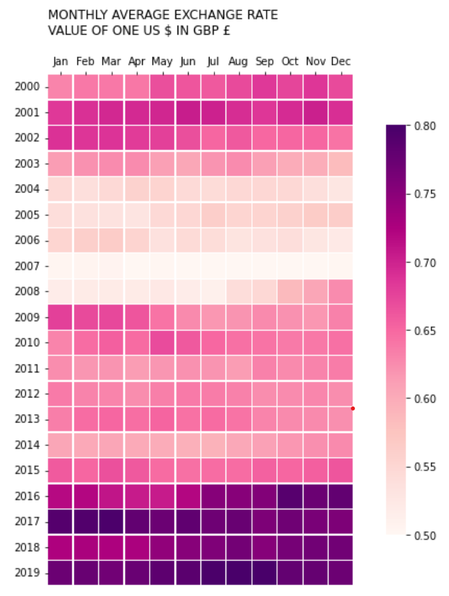
The second advanced chart was a heat map comparing GBP and USD exchange rates both over the years and over the months of the year. Before learning about these more advanced charts I would have likely used a line graph to represent this information. However, the heat map generated using sklearn in python, provides a much more compelling visual resource, and allows for faster access to understanding trends or changes across the whole picture.
Here is the link to the Google colab python notebooks where I conducted the data analysis.
Google Colab Google ColabWeek 10/11: Machine Learning


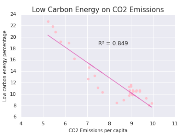
Week 11 and 12 were by far the most challenging portfolio tasks and I struggled a lot trying to understand what and why we were doing the techniques we discussed in the lectures. For supervised learning, I chose to explore regression. I understood the process more, and knew that a regression with the correct data would likely prove helpful in my research project. I performed the regression of low carbon intense energy on CO2 emissions, generated the regression graph and exported it. My regression visually shows a positive correlation: higher % of low carbon energy results in decreasing CO2 emissions. However, although my R value is statistically significant, it is not very high, so although there is a correlation, it is important to note the relation with some caution.
Week 10/11: Machine Learning
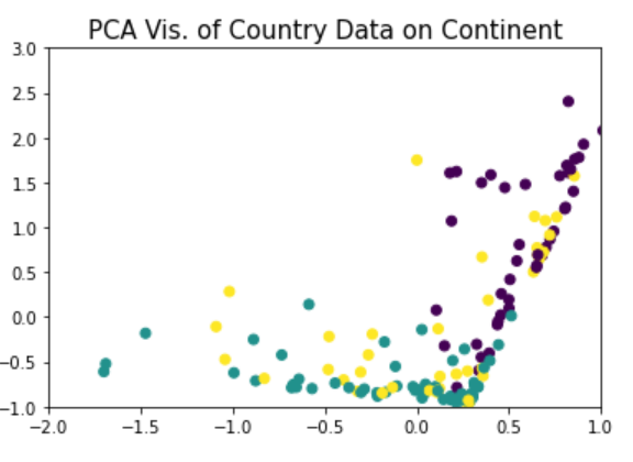
For the unsupervised learning, I chose the PCA method. I chose to perform it on a data set that outlined different continents and various characteristics for each of them. I first practiced the PCA process using the iris dataset in python. The dimensionality reduction process allowed me to take a complex data set with multiple variables, and convert then into a matrix and figure out the relationships between them, whilst staying considerate of their groups. I then plotted this onto a graph, where each colour represents a different group. I changed the axis values so that the plot would be more clear, leaving out 5 data points.
Here is the link to the Google colab python notebooks where I conducted the data analysis.
Google Colab Google Colab Google Colab